CASE STUDY
Transforming Tourist Services:
A User-Centric Solution

CONTEXT
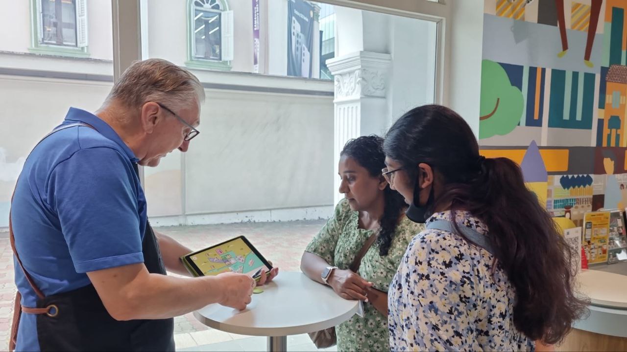
Singapore Tourism Board operates a network of Tourist Information Centres around Singapore.
Service staff at these centres provide assistance to many tourists.
Travel resumption after COVID-19 brings about manpower shortages for service staff at these centres.
MY ROLE
UX Lead
PROJECT TYPE
Exploratory UXR + UXUI
RESEARCH METHOD
Contextual Inquiry
Diary Studies
ACCOLADES
SG Good Design Award '23
JP Good Design Mark '23
PROBLEM

During peak hours, average staff to tourist ratio is 1:2.6
Tourists looking for recommendations could choke up the centres.
UNDERSTANDING
Staff are hampered by having to refer to multiple resources, slowing down service time.
Contextual Inquiry


Binders of manually
compiled information
Large amounts of information into binders and to extreme detail.
Information is often inconsistent, outdated and may not be understood by other staff.
Use of maps & brochures
Visual-rich brochures are welcomed by tourists and staff alike, but often discarded after use.
Google and others
When information is not available within the centre, staff resorts to using Google or other websites to obtain information e.g. Klook, TripAdvisor, etc.
UNDERSTANDING
Tourists ask for recommendations for places, essential info to help plan the day.
Contextual Inquiry

What can I see today?
Tourists typically ask for advice on how to plan their day based on their interests
Decision-making
Apart from information such as pricing and opening hours
Tourists need photos to determine worthiness of travelling to the destination
Locality & proximity
For efficient use of time, tourists prefer visiting places by zones — often wondering what's left to do in the area.
DEFINE & IDEATE
Tool to help service staff serve tourists better
How might we design a tool that allows efficient access of information so that service staff can provide quality and confident service?
→
A tablet app with consolidated information of places in Singapore
Digital solution makes it easy to scale operations, consistent experience ideal for future onboarding to new staff
How might we design a tool that helps tourists evaluate places of interest so that tourists can determine if a destination is worthy to visit?
→
A highly visual, map-based tool that gives users a quick overview of the activities they can do within the area
Design challenges
Most of the existing service staff are adverse to tech solutions.
Contextual Inquiry
Older service staff
Between 40s to 60s — they were ex-tour guides or retirees who are passionate about tourism.
While some are quick to adapt, others could perceive tech solutions as something negative based on their past experiences with tech.
Imminent move to tech
Organisational need to move into tech-based solutions for better personalisation with data.
Change management is required, and a well-designed product could benefit the organisation.
Involving them early
Understanding our users in-depth, and involving them earlier in the development process could bridge the gap.
Design decisions informed by our users can have a gentler learning curve.
DESIGN DECISIONS
User Interviews & Audit
Simplified & familiar

Geographically accurate maps add too much mental load on tourists.
Simplified, diagrammatic maps were designed, taking cues from subway maps and mini-games.
We looked into apps that our service staff frequently use and adopt similar design cues so everything feels like they've used it before.
Card Sorting
Intuitive groupings

Genres and categories could mean different things for different users.
Search feature — we had to come up with categorised groupings for different places in Singapore.
Involving our staff early, we did card sorting exercises to understand the mental model of how our staff would group places. Eventually derived at the final 8 categories.
THE DESIGN PROCESS


User Interface Design
Consistent design language
A consistent design principle was laid out for the entire app — simplified and subtle at the same time. We also made it a point to label icons to completely circumvent ambiguity.
Accessibility Design
Being inclusive
Ensuring the design is accessible for all types users — including elderly users, we had to make sure that fonts are legible, colours used creates sufficient contrast for efficient viewing.
OUTCOMES
A gentle learning curve for staff
and an effective tool for tourists on discovering new places
Usability Testing, User Interviews
Adoption & improvement
Achieved an average of 60,000 daily interactions, boosting consumer discovery of attractions and tourism-related businesses, achieving a 30% conversion rate for completed inquiry-based transactions.
Achieved business growth by increasing adoption from 3 to 12 (and counting) tourism stakeholders within a span of 6 months, including big-name hotels, heritage retailers and mall operators
The app helped simplify the service process by providing quick overviews of what an area could offer.
Feedback from tourists

Simple and effective maps help build mental picture of major tourist districts. They found it engaging with the visuals.
Many asked if it could be downloaded into their own phones.
TAKEAWAYS
Proxy/End User
Confusion between proxy user ("staff") and eventual beneficiary of this product being the tourists.
We ensured staff find it easy to use and tourists find the information provided via the app useful.
Being more targeted
For the first iteration of this product, we looked into the fundamental, common needs across all tourists.
JTBD were established for both tourists and staff. The product could do more to address niche tourist needs — from repeat visitors, to specific formats of visitors.
Define & measure
As the discovery process is entirely non-linear, it was hard to define and measure how a successful "transaction" looks like for tourists.
Apart from time taken to service a tourist, we could also look into the quality of service and the ideal state of satisfice for tourists.